반응형
HTML과 CSS로 토글 버튼을 만들어보겠습니다.
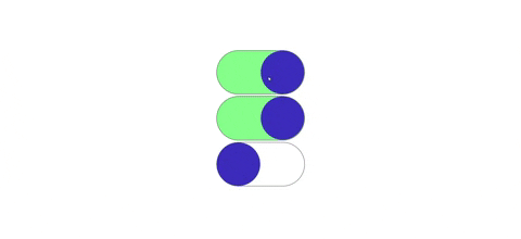
구현 코드
방법 1
HTML
<label>
  <input id="toggle" type="checkbox">
  <span class="toggle-circle"></span>
</label>
CSS
/* toggle */
label {
  height: 30px;
  width: 60px;
  border-radius: 30px;
}

input {
  display: none;
}

input:checked + span {
  background-color: gray;
}

input:checked + span::before {
  left: 30px;
}

.toggle-circle {
  height: 100%;
  width: 100%;
  display: block;
  border-radius: 30px;
  transition: 0.4s ease;
  border: 1px solid black;
  position: relative;
}

.toggle-circle::before {
  content: '';
  position: absolute;
  left: 0;
  height: 28px;
  width: 28px;
  display: block;
  border-radius: 50%;
  background-color: aliceblue;
  transition: 0.4s ease;
}
방법 2
HTML
<input type="checkbox" id="good" class="toggle">
<label for="good" class="label">
  <div class="ball"></div>
</label>
CSS
.toggle {
    visibility: hidden;
}

.label {
    position: relative;
    width: 80px;
    height: 40px;
    background-color: #d0d0d0;
    border-radius: 50px;
    cursor: pointer;
    display: inline-block;
    margin: 0 15px 0;
}

.toggle:checked + .label {
    background-color: #8e44ad;
}

.ball {
    background: #fff;
    height: 34px;
    width: 34px;
    border-radius: 50%;
    position: absolute;
    top: 3px;
    left: 3px;
    align-items: center;
    justify-content: center;
    animation: slideOff .3s linear forwards;
}

.toggle:checked + .label .ball {
    animation: slideOn .3s linear forwards;
}

@keyframes slideOn {
    0% {
        transform: translateX(0) scale(1);
    }
    50% {
        transform: translateX(20px) scale(1.2);
    }
    100% {
        transform: translateX(40px) scale(1);
    }
}

@keyframes slideOff {
    0% {
        transform: translateX(40px) scale(1);
    }
    50% {
        transform: translateX(20px) scale(1.2);
    }
    100% {
        transform: translateX(0) scale(1);
    }
}
이상으로 HTML과 CSS로 토글 버튼을 만드는 방법을 알아보았습니다.
728x90
반응형
'프론트엔드 > CSS' 카테고리의 다른 글
| Grid (0) | 2022.12.29 |
|---|---|
| Flex (0) | 2022.12.29 |
| Viewport (0) | 2022.12.29 |
| Media queries (0) | 2022.12.29 |
| CSS 컴포넌트 - 카운트다운 (0) | 2022.12.20 |


